


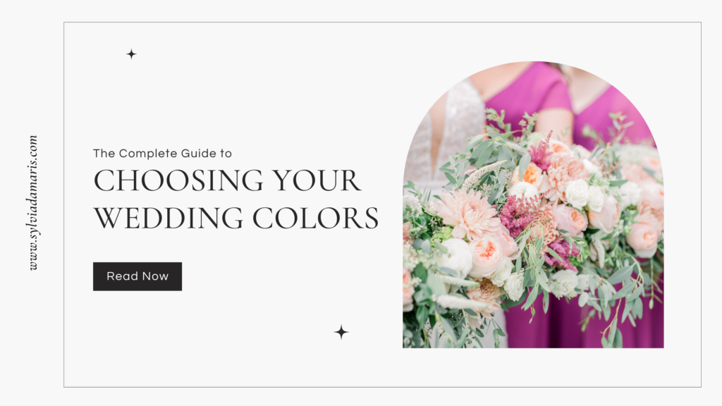
The Complete Guide to Choosing Your Wedding Colors for 2024
January 26, 2021
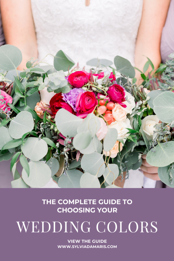
So it’s time for you and your fiancé to start picking wedding colors! In this blog post, we’re going to go through all the details you need to know — or might want to think about — when choosing your wedding colors. If you want a wedding that looks cohesive and high-end, you’re in the right place!
If you’ve gone to a few weddings, or if you went to pre-Pinterest weddings, you’ve probably seen for yourself what it looks like when color palettes don’t work out. Weddings can look cheesy, cheap, and poorly thought out if the colors are chosen wrong.
Do you have to choose wedding colors? Well, no. But if you want your wedding to look cohesive and high-end on your wedding day and in pictures, choosing wedding colors that are consistent throughout will go a long way toward making that happen!
CONTENTS
-
Understanding Color & Style
-
How Seasons Affect Wedding Colors
-
How Color Choices Look in Photos
-
The Importance of Your Unique Aesthetic
-
The 5 Steps to Picking Your Wedding Colors
-
Where to Put Your Colors
-
THE MOST IMPORTANT Tip for Implementing Your Palette
1 Understanding Color & Style
Before we start talking about weddings specifically, let’s look at the good old color wheel.
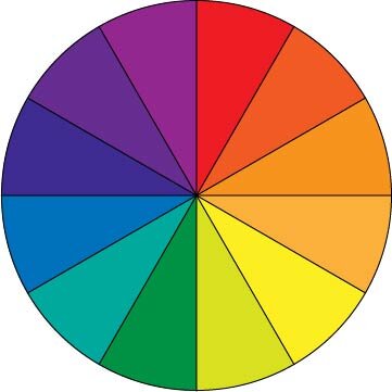
If you’ve been in any kind of art or design class, you’ve probably seen this! We’re not going to dive too deep into color theory, but I will show you the basics of how to use the color wheel and what that looks like in the context of a wedding.
Color Combinations that Look Good Together
There are a few ways to use the color wheel to find more colors that look good with a color you love. Some work better than others for our purposes. Others really belong in marketing and graphic design more than in your wedding vision board.
Complementary
Complementary colors are on opposite sides of the color wheel. Red and green, blue and orange, purple and green — all complementary. When you combine complementary colors, both colors POP. In weddings, it’s a great idea to choose two muted colors that complement each other.
Succulent and Citrus Vision Board
Romantic Red Rose Vision Board
Monochromatic or Gradient
Monochromatic, also known as gradient, is many shades (light to dark) of one color. This is a huge trend in weddings right now! Monochromatic weddings look very cohesive, but can start looking a little bland unless you add in another color or two to help your gradient stand out.
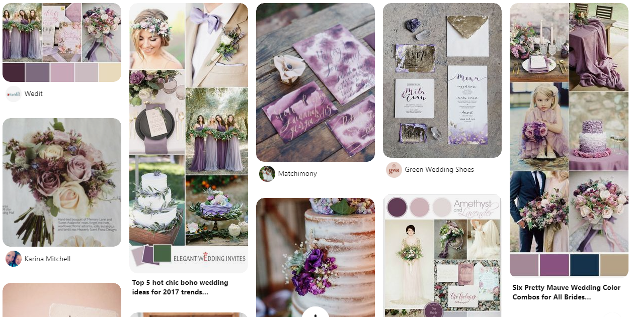
Amethyst & Lavender Vision Board
Analogous
Analogous colors are next to each other on the color wheel. This is a fabulous way to make your wedding look cohesive without getting bland. You can even choose a color from the opposite side of the color wheel to make your analogous colors pop.
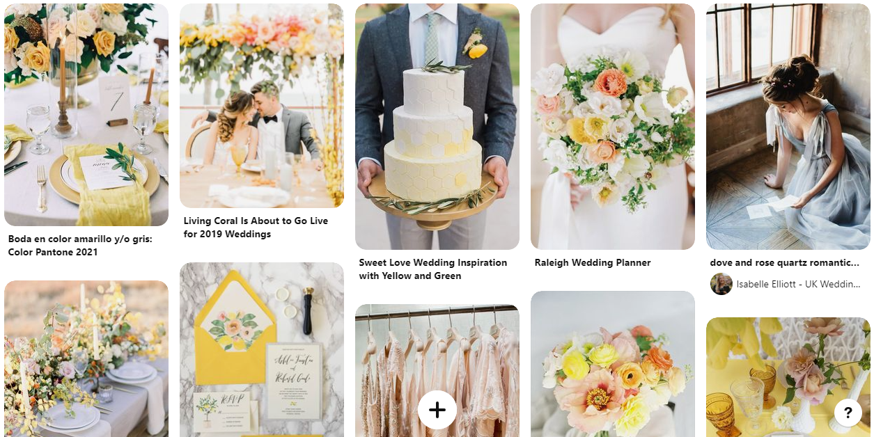
Yellow, Coral, and Pink Vision Board
Soft Autumn Tones Vision Board
Triadic & Tetradic
Triadic and tetradic color palettes are spaced out around the color wheel in a way that creates very BRIGHT and CONTRASTING palettes. While it may grab your attention when you’re scrolling, both color schemes would look totally wrong for a wedding. Imagine having a purple, green, and orange wedding! Yikes!
If you want to learn more about the different types of color coordination, check out this color wheel from Canva and play around a bit!
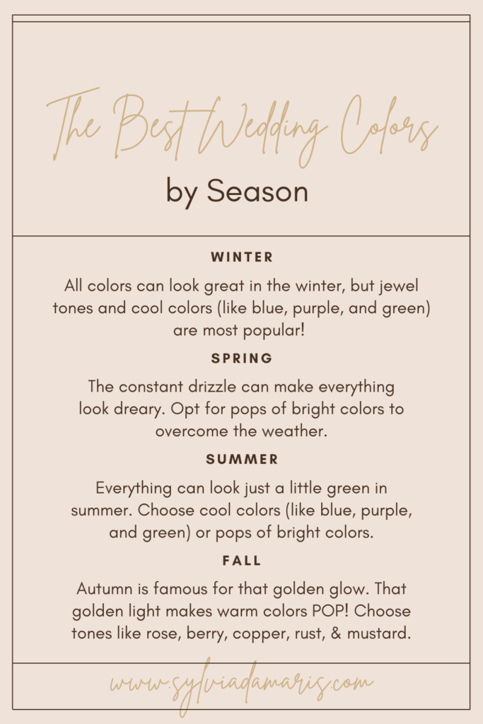
2 How Seasons Affect Wedding Colors
Before you settle on your wedding colors, it’s a good idea to choose a wedding date — or at least a season! There are several reasons for that. The first is simply based on fashion. Why do we wear jewel tones, tights, and leather boots in the fall? Partly because that’s what’s fashionable. Why do we wear bright colors in the summer? Partly because it’s fashionable. You certainly don’t have to stick to colors that Vogue would choose, but it may help you narrow down what you want!
Light
Let’s take a minute to talk about the thing that lets us see color in the first place: light. Light can change based on the season. For example: during the Midwest winter, there are fewer hours of daylight, it’s often overcast, and light tends to look CLEAN because there aren’t very many colored surfaces around (the snow covers it up). Let’s break it down.
Winter
Weather: mostly overcast
Color of Light: white
If there’s snow where you live, winter light tends to have very white, clean light. The white snow bounces light everywhere, making your colors look clear and lovely. Any color can look great in the winter.
Spring
Weather: overcast or sunny
Color of Light: white
Spring light is similar to winter light, but it’s likely that the snow has melted, which means overcast days will tend to be darker than they were in the winter. You’re more likely to have sunny days in the spring! Any color can look great in the spring. Try using pops of bright colors to fight the dreary weather.
Summer
Weather: mostly sunny
Color of Light: green
Once the greenery is back, those lush trees and bright green lawns actually bounce green light all over the place! You wouldn’t notice just looking around, but summer light is actually just a little bit green. Because of that, you want to choose BRIGHT or COOL colors. Bright colors will overpower that green light enough that they will look great. Cool colors (blues, greens, purples) will be even more rich with the green light on them.
Fall
Weather: overcast or sunny
Color of Light: golden
As the leaves fade to red and gold, that green light turns into warm, golden light instead. It’s so golden that you’d probably notice it walking around! Even after the leaves fall, everything is a golden brown color until the snow comes to cover it up. That warm light makes warm colors look more rich. Colors like red, rust, copper, pink, and mustard are made richer by the golden fall light. Avoid bright colors, since they can clash with your colorful fall surroundings.
Flowers
Another thing to think about when planning your color around your wedding date is what flowers are in season. Choosing in-season flowers is not only easier on your wallet, but some flowers really can’t be found in your area at certain times of the year! We’ll talk later about how flowers affect the overall style of your wedding.
When it comes to choosing your colors, know what flowers are in season and whether or not they come in your preferred colors! This is a great resource for what flowers are in season throughout the year, but it’s only a starting point. It’s a good idea to check with your florist before solidifying your wedding colors.
Choosing In-season Flowers by The Budget Savvy Bride
How Color Choices Look in Photos
If you haven’t already picked a photographer, start thinking about what photo style you prefer before you nail down a color palette. Why? Because editing style can drastically affect how your wedding colors look! Here’s a breakdown of a few of the most popular styles:
True Color
True color editing is very minimally edited. Basically, if the photographer is good, they probably essentially deliver most of your images straight out of camera. True color editing means that any colors you choose will be represented exactly as they were chosen, but it can also mean that bright colors seem way too bright against backdrops of greenery. If you love true color editing, opt for muted jewel tones or “dusty” pastels.
Film Inspired / Light & Airy
Film inspired, also known as light and airy, uses digital photography to get the look of film. The images look bright (but not overexposed), timeless, and clean. It is super flattering on any skin type, and has been the go-to style of wedding magazines for decades. While any colors can look good in this editing style, if you love light and airy, it’s a good idea to stick to light colors and/or pops of bright colors. Neutrals are your friend! Most film-inspired photographers work with the greens in the image to help your wedding colors look their best.
Warm and Bold
The warm and bold editing style is very popular right now and can be very flattering to your skin. The trouble is, it’s not always flattering to your wedding colors! Warm and bold editing makes images look more “orange” (what we call “warm”) and increases contrast in a way that flatters all the right parts of your face. Watch out for cool colors like blue and green! The warm and bold editing style can make them look muddy, including the greenery in the background. Warm colors like red, copper, and mustard can look their best in this editing style!
Dark and Moody
Dark and moody editing is another trendy style. This editing style is inspired by painters like Rembrandt, whose paintings were always dark with strategic bright spots to grab your attention. Photographers editing dark and moody usually make their images very dark with relatively little contrast to bring attention to faces and dramatic light. This style was made for jewel tones. They look rich and really pop against your skin!
The Importance of Your Unique Aesthetic
Right now, you might be feeling overwhelmed by all of the possibilities in front of you. In the next section, we’re going to break down the 6 steps to picking your wedding colors. Before we do that, I want to take a moment to remind you of something: all that matters at the end of the day is that YOU love your wedding colors.
What You Like Matters Most
Think about your wardrobe. What colors do you like to wear? What’s isn’t in your closet at all? If you wear blue all the time and wouldn’t be caught dead in a red dress, don’t choose red as a wedding color. You love blue because blue looks good on you. It flatters your skin tone and eye color. Even though you won’t be wearing your wedding colors (unless you opt for a colored wedding dress!), you will be surrounded by them. So choose colors you already love!
Trending Wedding Colors
Are you a person who likes to follow fashion trends? If so, you may be hoping to choose wedding colors that will be popular in 2024. Here are a few color trends that I see gaining or continuing their momentum in the next year or two:
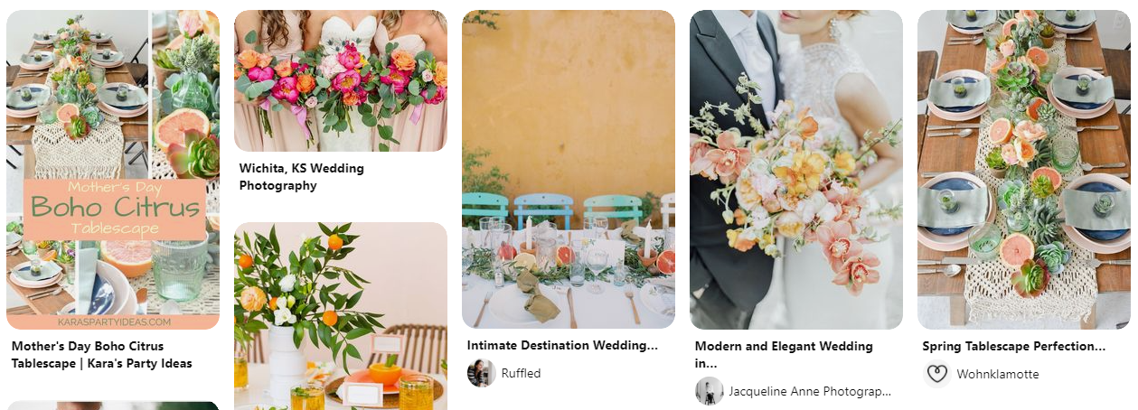
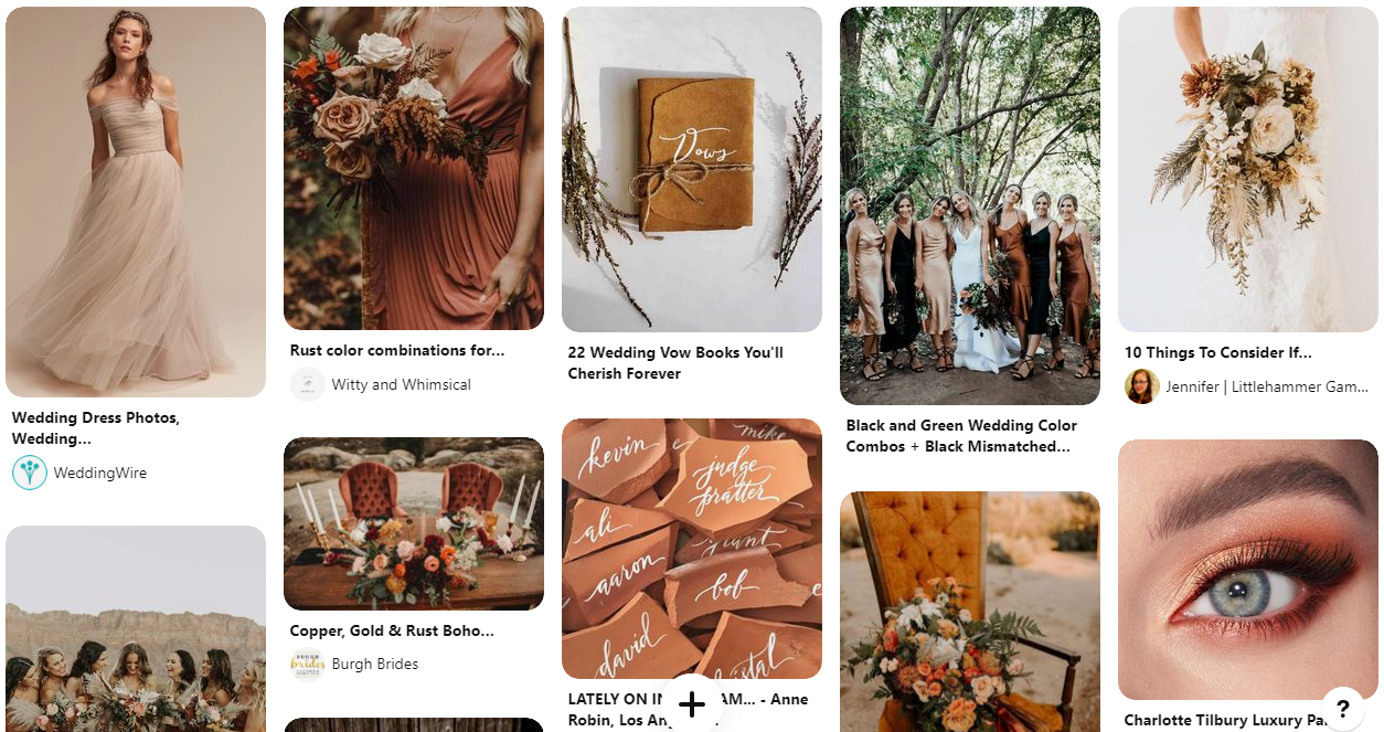
Warm Earth Tones
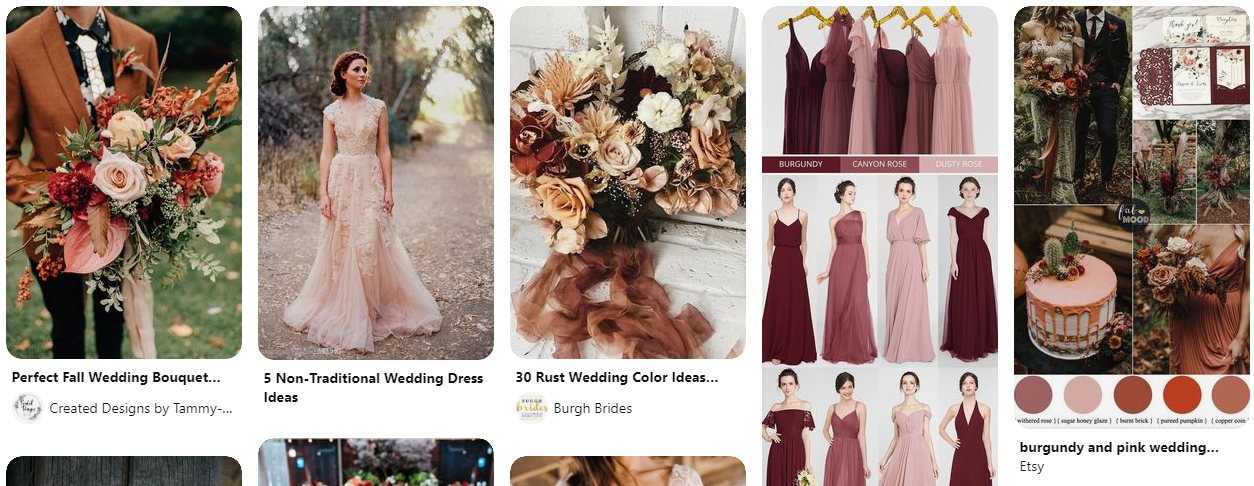
I am loving all of the fall color palettes coming this way in the next 2 years. We’re going to be seeing a lot of rust, copper, dusty rose, and other warm earth tones. Here are a few examples of the trend:
Soft Autumn Tones Vision Board
Dusty Anything
Take any pastel and turn down the color saturation and you have DUSTY ANYTHING. This has gained popularity over the last several years. You can see all kinds of examples of dusty colors here:
Dusty Blue & Blush Vision Board
Dusty Rose & Sage Vision Board
Gradients
I am loving this trend. Instead of having your bridesmaids in matching colors, you instead have your girls wearing different shades of the same color. Here are some examples:
Amethyst & Lavender Vision Board
Neutrals As Colors
Brides are opting for bridesmaid dresses in colors like soft gray, taupe, or even white, making those neutrals one of the main wedding colors. If you want your wedding to look incredible in almost any editing style, this is a great choice! You can see some vision boards here:
Green, Gold, & White Vision Board
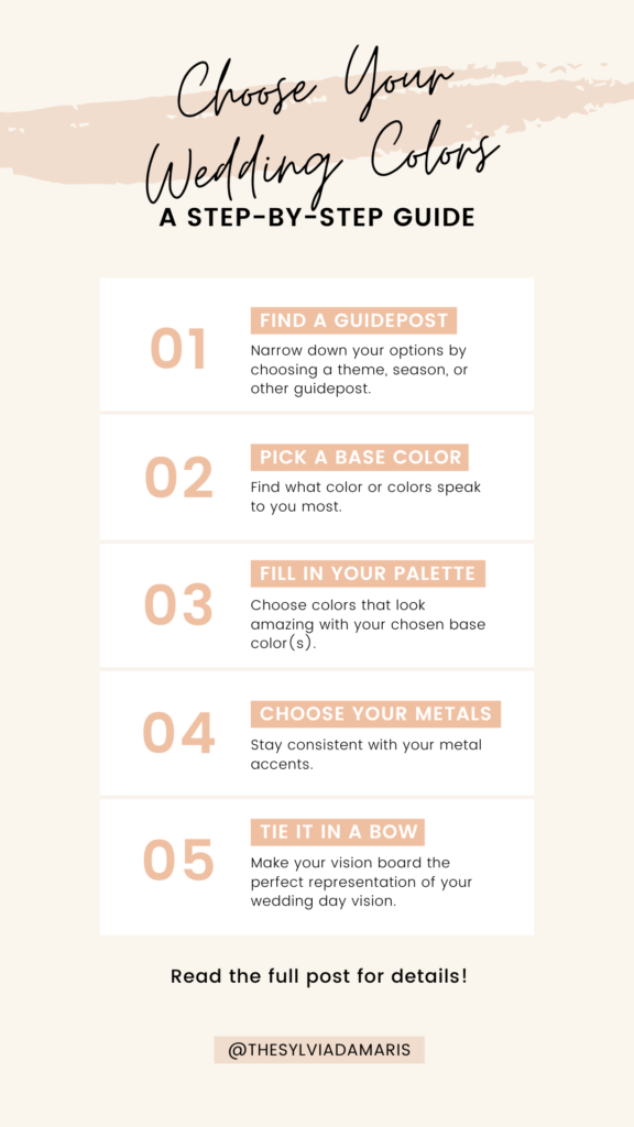
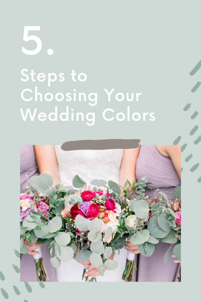
The 5 Steps to Picking Your Wedding Colors
Before we go any further, if you don’t have Pinterest, go sign up right now! Everything we’re about to talk about is easier with Pinterest. If you do already have Pinterest, I want you to start these 5 steps with a clean slate.
Step 0: Go ahead and either create a new board or create an empty section for your wedding board. This board or section will be your vision board for your wedding.
Without further ado, the 5 steps to choosing your wedding colors!
Step 1: Find a guidepost
There are a million and five options out there for your wedding colors. Chances are, you’re going to like more than one of them! I find it’s easiest to start planning your colors by narrowing down your options.
In this step, you will choose a theme, season, aesthetic, OR wedding venue to base your color palette off of. We’ll call that your guidepost. You probably want to choose only one of those things, otherwise you might narrow your options too much.
Season
Example: Fall
Seasons are probably the most popular guidepost for choosing your wedding color palette. It’s especially helpful if you’re getting married in summer or fall, but it can be useful for the other half of the year as well. For more details on how this guidepost narrows down your color options, look back at the How Seasons Affect Wedding Colors section above.
Aesthetic
Example: Boho chic
If you want to base your wedding colors on your own personal aesthetic (how you dress, wear makeup, do your hair, etc), try coming up with some descriptive words. Here are a few examples:
-
Boho
-
Chic
-
Glamorous
-
Rustic
-
Romantic
-
Vintage
-
Modern
-
Whimsical
-
Casual
-
Southern-inspired
-
Natural
Theme
Example: Botanical garden
Choosing a theme can be a great fit if you already have a picture in your mind of what your wedding will be like. Your theme could be anything from “garden party” to “enchanted forest” to “wildflowers”. This type of guidepost can be super powerful in making sure your wedding look consistent and high end, but if nothing comes to mind quickly, it might not be the right guidepost for you!
Wedding Venue
Example: The Covenant at Murray Mansion – Historic, Bright, Elegant
If you haven’t already chosen a wedding venue, you’ll be choosing your wedding venue partly based on one of the above guideposts. If you HAVE, it’s a good idea to start here. For this guidepost, look through your venue’s wedding gallery. Choose 3 words that describe the venue. That’s your guidepost!
VISION BOARD STEPS:
1. Select your guidepost.
2. Search Pinterest for “[guidepost] wedding”
3. Pin things you LOVE that match your guidepost to your vision board.
4. Ignore anything that doesn’t perfectly match your guidepost!
Step 2: Pick a base color
Now that you’ve started pinning things to your vision board, you will probably notice that a lot of the images you just pinned have some colors in common. What are they? What stands out to you?
If you’re loving one color, that’s your base color! If you’re loving more than one color and they look good together, they can both/all be your base color!
If you’re loving more than one color and they don’t look good together, here’s what you do:
-
Search Pinterest for “[color] wedding” for each of your colors.
-
Pin things you LOVE that match your guidepost to your vision board.
-
Check back on your vision board. What other colors stand out to you? What color or colors do they look good with from the first round? Those are your base colors.
VISION BOARD STEPS:
1. Search Pinterest for “[color(s)] wedding”
2. Pin things you LOVE that match your guidepost to your vision board.
3. Make sure you’re pinning lots of types of things including:
-
Bridal gowns
-
Bridesmaid dresses
-
Flowers
-
Groom & groomsmen attire
-
Shoes
-
Invitations
-
Table settings
-
Centerpieces
-
Place cards
You may need to be more specific in your search, but always include your chosen base color in the search!
Step 3: Fill out your palette
You probably have a pretty full board now. Try to narrow down your palette to about 5 of the colors pictured on your board. Greenery (the leaves and stems in bouquets, for example) doesn’t count as a color, but neutrals do.
VISION BOARD STEPS:
1. Select about 5 total colors for your palette (including the base color(s))
2. Delete or remove anything from your board that doesn’t match your guidepost AND palette.
Step 4: Pick your metals
An important step in this is deciding which metal or metals look best with your palette. There are no hard and fast rules here — just decide what you like. It will probably matter in a few of your decisions what metal tones you choose, so be sure to choose ahead of time so you can stay consistent. If you want to add metals to your vision board:
VISION BOARD STEPS:
1. Select your metals
2. Search pinterest for “[base color(s)] [metal] wedding”
3. Pin things you LOVE that match your guidepost and color palette to your vision board.
Step 5: Putting it all together
Your vision board is going to be your go-to reference when you talk to your venue, your planner or day-of coordinator, your florist, your rental company, your photographer, and more. When your florist asks what you were picturing for your bouquet, send her your vision board. When your photographer asks what your wedding will be like, send her your vision board. Before you call it a day though, it’s time to clean up your all-important vision board. Go through the entire thing and do the following:
VISION BOARD STEPS:
1. Make sure you have one or more pin showing each of the following:
-
Bridal gowns
-
Bridesmaid dresses
-
Flowers
-
Groom & groomsmen attire
-
Shoes
-
Invitations
-
Ceremony
-
Table settings
-
Centerpieces
-
Place cards / table assignment
-
Favors
-
Cake
-
Other details you love
2. Delete or remove anything from your board that doesn’t match your guidepost AND palette.
IMPORTANT: Once you’re done, pin anything new to another board or section. Keep your vision board unchanged.
Where to Put Your Wedding Colors
You probably already know that you’ll be using your wedding colors to choose things like bridesmaid dresses, flowers, etc, but there are some unexpected places you may want to put your colors.
Engagement Session Outfits
If you’re using engagement photos for your save the dates, consider dressing in your wedding colors for the engagement session! Believe it or not, it could make your detail pictures look better!
Invitations
As a photographer, I can tell you that photographing invitations and other details really sets the tone for the entire day. Your details are how I orient myself to your style and color palette. If your invitations match your wedding, that helps me a ton! It also makes your wedding look way more high end and consistent in the blog post.
Detail Styling Accessories
Speaking of details, consider providing your photographer with some accessories that match your guidepost and color palette! Here are some examples:
-
Ribbon
-
Mrs. Box
-
Stamps or wax seals
-
Ring dishes or plates
Vow Books or Stationery
If you’re writing your own vows, consider writing them down in a vow book! These little vow books are super cute and classy. Vow books that match your color palette? Even better.
Perfume
When I think about a high end wedding, a stunning perfume shot comes to mind. Make sure your wedding day perfume fits into the color palette so your photographer can show it off!
THE MOST IMPORTANT Tip for Implementing Your Palette
Believe it or not, the screen you’re reading this blog post on may be showing you slightly different colors than it shows someone else. Unless your screen is color calibrated, there’s a good chance that what you’re seeing is not exactly true to life. That’s why, if I could give you one tip to make sure your wedding looks consistent and high-end, it’s this:
See everything in real life before you buy!
Shopping for bridesmaid dresses online? Don’t just order the color swatch you think is going to win. Order all the color swatches that might fit your vision. It’s worth the extra $7 to make sure your wedding looks amazing.
Now that you have those swatches, bring them along to the florist, the venue, the rental company… any time you can see things in person, do it. It makes all the difference!
What are your wedding colors?
Now that you’ve chosen your wedding colors, let’s see them! Let me know what you chose in the comment, or drop a link to your vision board! I can’t wait to see what you come up with. Happy planning!
get in touch

if you're still here...
You might be my kind of people!
If you've found the Han to your Leia, the chips to your guac, the princess to your toad, you need a photographer who will feel like a natural part of your wedding day but know when to hang back and let you have your moment. If you're loving what you see on this page, let's get you scheduled for your free consultation to find out if we're as great of a fit as I think we might be!
get in touch
get in touch —


